Don’t forget to check out Smartketplace and help support local small businesses…
As an avid hockey fan born to a hockey family in Chicago, Anthony Roy owns several Chicago Blackhawks products and gear. But as an American Indian, a member of the Ojibwe tribe, Roy struggles with having to support the local team using a symbol he thinks is ugly and derogatory.
“It’s problematic to even see myself in the wear,” Roy said. “I know it’s wrong that to support your team you have to do that.”
The Chicago Blackhawks, named after Chief Black Hawk of the Sauk tribe, and its Indian head logo put Native Americans in the same repertoire as the wild animals more commonly used to represent sports teams, Roy said.
“It dehumanizes my people,” he said.
Roy thinks an animal-based logo would be a more suitable fit for the franchise.
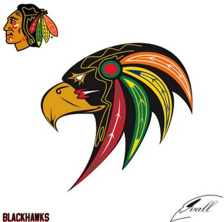
That’s why after the Blackhawks won the Stanley Cup in 2010, he created “This should be the Blackhawks logo!,” a Facebook page featuring an alternative Blackhawks logo. The design uses the same set of colors and native styles as the current team insignia, but depicts a hawk-like black bird instead of an Indian man.
The page has 583 likes, with most comments supporting the design and encouraging Roy to trademark it.
But the design will most likely never be the new team logo.
Mike Ivall, a Toronto-based graphic designer, drafted the symbol in 2008, partly in response to public outcry against the current Blackhawks Indian head, but mostly out of passion for designing hockey logos.
“Personally I have had no issue with the Hawks logo, nor has any of my family, which are all proud Ojibwas from southern Ontario,” Ivall told Chi-Town Review in an email.
But Ivall wanted to offer an alternative and posted his Blackhawks rendering to a popular hockey-themed design website.
“It was a big deal,” Ivall said.
Such a big deal that several groups, a few of them small hockey teams, began using the design without Ivall’s permission.
One of these organizations, based in Chicago, printed the logo on t-shirts and sold them to Blackhawks fans.
Those shirts are rare sights today, but are sometimes spotted around Wrigleyville or at hockey games, Roy said.
Ivall eventually sold the logo to the Maplesoft Hawks, an Ottawa-based children’s hockey team.
The design seems to have declined in local popularity, until recently, after the Blackhawks’ second Stanley Cup win in three years.
Some Twitter and Facebook fans are standing with Roy, echoing his Facebook page’s proposition and seemingly unaware that the design has been sold.
Still, Roy said he has no doubt that the Blackhawks will someday update its logo to an icon that’s less controversial. He hopes to someday become more involved in the movement to end Native American characterizations in sports.
“People will wake up eventually,” Roy said. “I have high hopes. It’s all in due time.”


The Blackhawks will not be changing their logo any time soon.
Oh stop it. Get off your high horse. There is nothing wrong with the logo. Nobody looks at it and thinks, “woof, that indian guy is ugly.” Do Irish people get pissed about Notre Dame’s goofy mascot? Do white people get pissed because Wendy is a ginger and not representative of caucasian people as a whole? Do Black people get upset because Aunt Jemima is a little chubby? No, and if they do, screw them too. And screw whoever decided to take the Chief away from U of I.
Seriously FUCK THAT!! Whoever doesnt take pride in this is far off base and looking for things to offend them. I hate seeing that “new” logo. I hope the blackhawks never throw away there pride and history for the overtly sensitive..
Have you no pride in your Indian heritage? I have quite a few American friends and none of them see anything wrong with the Blackhawks logo. Personally I have always liked this logo. A good looking Indian in warpaint ready to do battle!